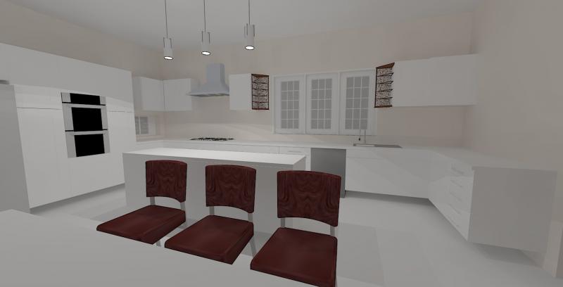
Kitchen Layout, please critique

Joined
14 Nov 2007
Messages
14
Reaction score
0
Country
United Kingdom
Hi,

we're having an extension done which will join a "sort of" out-building to the kitchen/diner giving us a wider kitchen/diner and a utility room. I've attached a rough plan of what I've been able to design for the new space (grayed area is the extension with a velux windowed roof) but I've no confidence in my ability and would really appreciate some comments and suggestions to improve my design.

It is quite a rough design, the sink is missing from the island, I need to add spotlights, finish the wall cabinet layout, under cabinet lighting etc - but if the whole layout can be bettered I'm not going to add any frills just yet.

Thanks

 
Sponsored Links
I'd put the cooker on the island and the sink under the window..
that way you can talk to people sitting at the table while you cook...

gives you more upper cabinet space along the wall where the hood is now.. looks a little strange with that one lone cabinet next to the glass hood..

the island would need a higher back to it to stop people on the other side from getting at the pots and pans etc.
 
looks ok to me
only thing i wouldn't do is have a wall of cupboards with the ovens in it. just the oven unit but that would be personal preference not anything wrong with it.
 
Looks good to me aswell. Can i ask what software you used or website to design it as i am currently trying to design my own on the b&q website. Thanks
 
Sponsored Links
Hi, thanks for the suggestions.

I'd love to put the cooker on the island, I think it's a great look - BUT, my mum's the cook and she makes a mess when she's cooking, also she uses a chip pan so she's wary of having the cooker in a position where there's no splashback.

The sink under the window - yep, I want that. I'm thinking however that with the cooker being where it is the sink should be mirroring it - so I'm probably going to expand the window so that the sink is under it. That's something I forgot to mention, I'm flexible with window positioning and the position of the double doors (which is why, with such freedom, I'm sure I'm not making the most of the space available).

The cabinet on its lonesome does look weird so I've modified the window and added a (bad representation of a) corner shelf unit to try to balance it out. The picture is attached but it's a bit rough.

The tall cabinets I'd like to keep as my sis has them and to me they look swanky.

nabby68 - I used Google Sketchup 7 (http://sketchup.google.com) to model the kitchen, and the rendering is done using the Kerkythea sketchup plugin (http://www.kerkythea.net/joomla/). Both are free.

 
looks awkward to me can you not rotate the island through 90 degrees and have the table at the boiler end
it may just be the prospective off the diagrams but the table is mixed right in to the buisness end off the kitcken :rolleyes: :rolleyes:

also with all the seats occupied will you have to pass the other side off the island for access
basicly the space where the table is dosnt look big enough for up to 8 seated people
 
buy her an electric chip pan, they're safer anyway.. never heard of a chip pan fire from an electric chip pan...

or if you do a lot of chips, get one integrated into the cooker... I'm sure they do them...

so the windows and doors are not fixed openings then?
 
Thanks for the replies :)

big-all: the dining area is the bit that seems like it could be a problem to me too. The diagram shows the table with chairs fully extended so I could get an idea of whether there is enough space or not. It's a 1m wide table - in it's position in the diagrams there's 90cm from table to wall and 118cm from table to island. I positioned it on the premise that an absolute minimum of 2.5ft of clear space around the table is needed (which I got off some website).

Currently the room has a 6 seater where the boiler is, and that's really cramped. Also, I'm not sure about having the table on that side as it will be directly in front of the entrance to the room and the wall that jutts out at the entrance might make getting passed the table difficult. But I will give it a go and see if it's viable.

Here's a diagram of the room from an above view -


ColJack: I think I'll get her an electric chip pan - but she still won't want to cook on a kitchen island :LOL:

The windows and doors are going to be replaced (we're having the floor raised around 8 inches so the main window on the right hand wall will be too low if kept as is) so positioning is flexible at the moment. French door positioning is flexible too.
 
I've slightly adjusted things - there's now 2 windows on the side wall -


This way the kitchen sink is properly under a window and the cooker is sufficiently far enough from the larger sink as to not make the sink in the island redundant.

I'm not sure about how to position the dining table however. I have come up with 3 options:


Long orientation - table possibly too close to the wall?


wide orientation - maybe too messy footflow wise?


table joined to island - I like the way the space looks - but not sure how eating at a table so close to the island would feel.

If anyone has any opinions please let me know (my dad's stressing me for a design and he's not prepared to pay a professional :rolleyes:

Also, regarding the island - is there any way to build one without needing to build a small stud wall?

Thanks
 
I've fitted many kitchens and your plan looks very nice but a lot of walking to do, the golden rules is the triangle pattern for less traffic. IMO the U-shape kitchen layout is the most popular because of less walking, people have told me afterward they wished they listen to me because it can be tiring running around a long kitchen but they some rather have it like a show house kitchen layout and put up with it.
 

DIYnot Local

Staff member

If you need to find a tradesperson to get your job done, please try our local search below, or if you are doing it yourself you can find suppliers local to you.

Select the supplier or trade you require, enter your location to begin your search.


Are you a trade or supplier? You can create your listing free at DIYnot Local

 
Sponsored Links
Back
Top